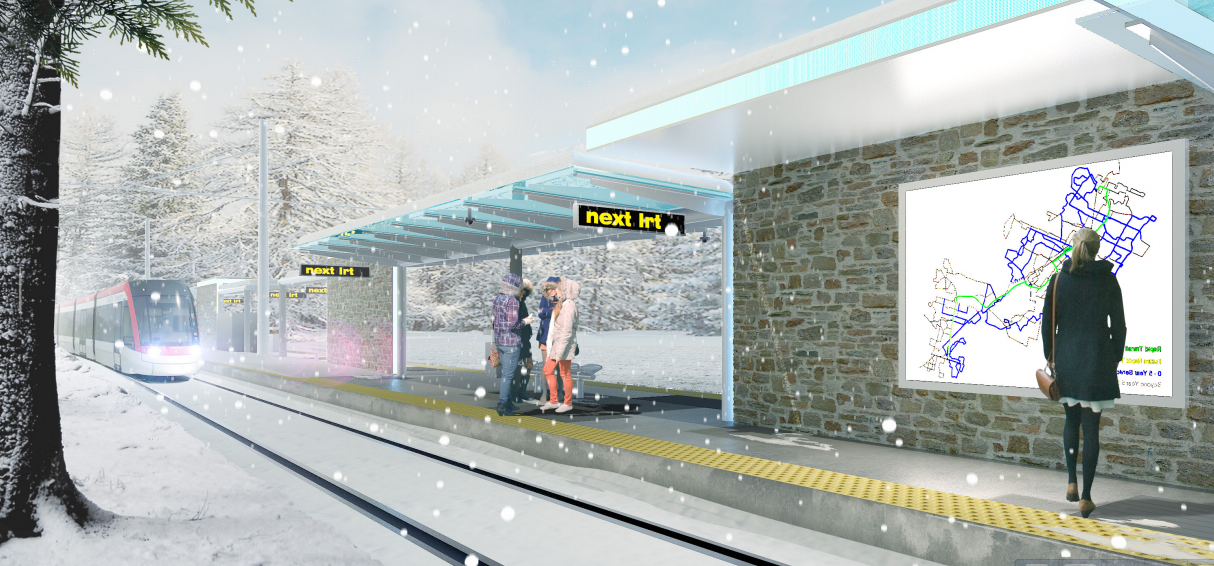
Recently, we looked at transit stop design for ION through the lens of branding. Today, we’d like to explore the impact stop design has on way-finding, legibility, and providing information to transit users about when to expect the next bus or tram.
Finding our way
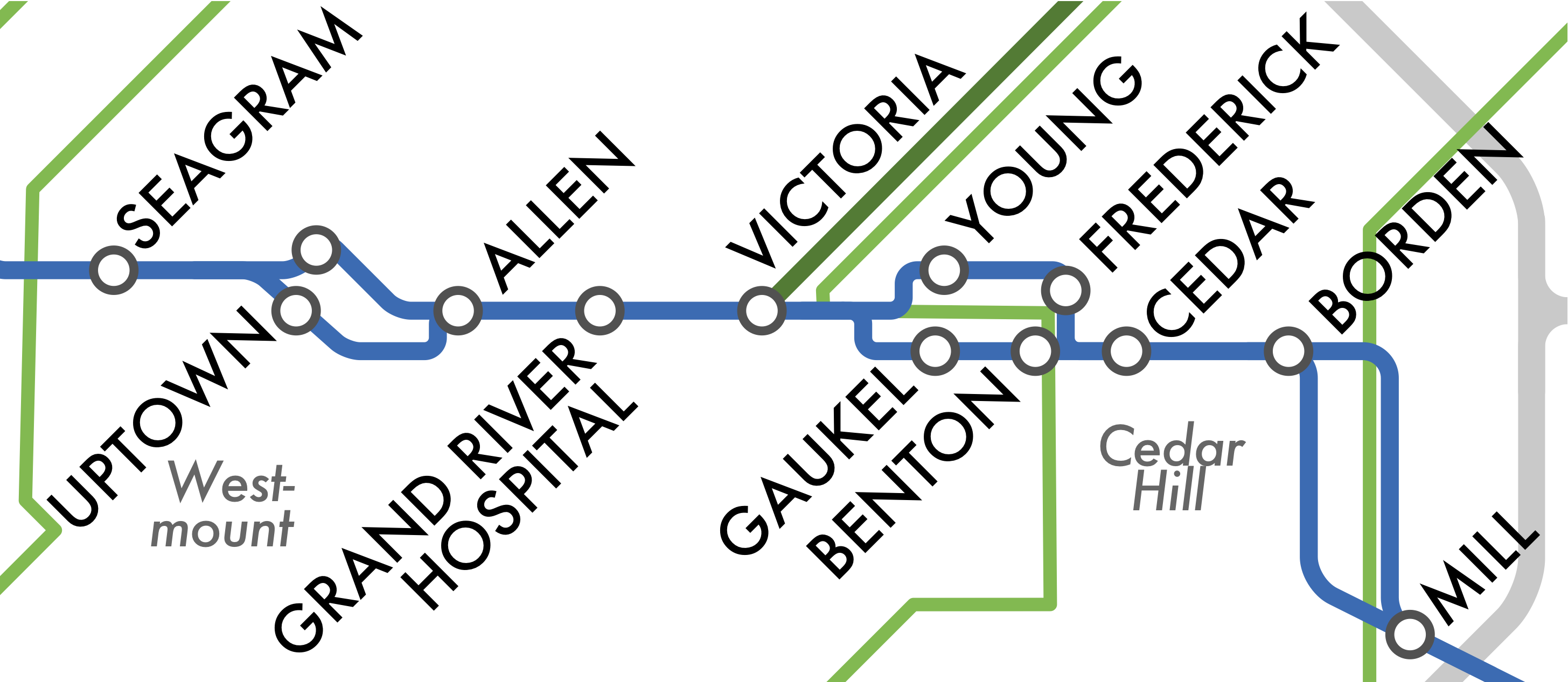
Good way-finding cues will be critical for the integration of ION with iXpress buses and neighbourhood routes. Aside from the stop on Caroline, ION trains will have their own platforms distinct from bus stop platforms. (The aBRT stops however will be accessible by both ION and regular buses.) The Victoria Street multi-modal hub will need to allow connections between ION, iXpress, local routes, taxis, GO and VIA trains, and intercity buses. On top of all this is the fact that north- and south-bound direction stops are split by one or two blocks in both the Kitchener and Waterloo downtowns. Planners will need to be proactive in ensuring that the experience of the Grand River Transit network is a seamless one.
Spacing describes various way-finding systems in Toronto’s subway network, whether existing, proposed, or pending implementation. Platforms feature horizontal lines on the walls, corresponding to the colour of the subway and RT lines on its maps. In the 90’s, new enhancements were designed but never fully implemented. Lines were assigned numbers, and line colours and numbers were also to be added to signage outside of stations. The colour red was chosen to direct passengers towards buses. Additionally, each station would be given a distinctive crest which would also feature the colours of the lines that served it.
ION stop areas could benefit from similar mindfulness in design. Five iXpress routes will intersect the line at eleven different stops. Differentiating these stops to identify potential connections could also be achieved with colour. What if, instead of merely directional signs, coloured lines in the pavement provided direction between ION and iXpress platforms? (Building upon this idea with the principles of universal design, these pavement lines could also be textured to give guidance to the visually impaired.) This may require refining the iXpress brand somewhat so that different routes are more distinguishable from each other, but the net result would be a system that appears visually the same on foot as it does as lines on a map.
Next stop: somewhere?
The identification of stops is also critical piece of the way-finding puzzle, and are far more important than just the marketing opportunity unique stop decorations provide.
Stop names have the potential to convey both a sense of place, as well as connecting corridors. There is temptation to use stop names for other purposes, but this should be avoided as much as possible. As transit expert Jarrett Walker writes,
“Station naming is not an opportunity for creativity, or corporate sponsorship, and it can even be problematic as a way to honor a civic leader. The purpose of station names is to tell us where we are.”
The Rapid Transit team is planning on holding a naming contest for certain ION stops – we hope that the ability for proposed names to identify a location weight heavily in the evaluation criteria. Otherwise, a significant feature of network legibility will be lost.
Update: The station naming contest didn’t happen. Council has now approved set of station names which generally identify stop locations.
Where’s my bus?
The provision of real-time information has been found to significantly increase the satisfaction of using transit and reduce the perceived amount of time waiting for a bus or tram. Electronic real-time displays are intended for the ION platforms, but will similar information be provided for connecting bus routes which may require longer waits? The separation of bus and train platforms pose an additional challenge for trips that could be served by either bus or rail, similar to that experienced on York Region’s Rapidway. How does a user decide which platform to stand on to be served the fastest?
 While efforts to provide real-time data that can be accessed via smartphone should be encouraged, these will not entirely address the problem, as significant numbers of people do not have access to mobile data. Additionally, on the coldest days, when knowing when your bus will arrive might bring the most comfort, you really don’t want to expose your fingers to use a touch screen.
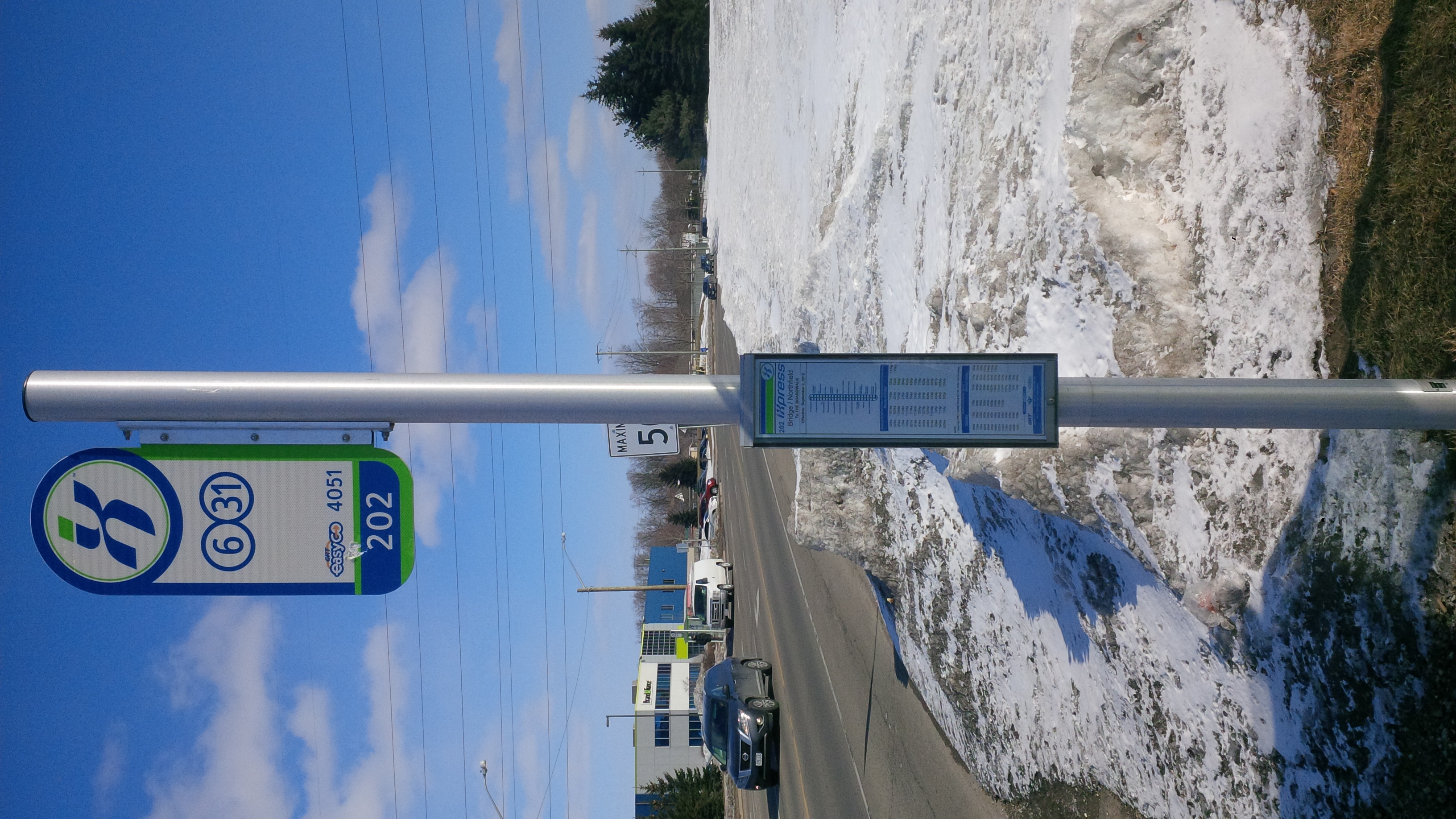
GRT also has an opportunity to greatly enhance the static information provided around its ION and even its conventional bus stops. Again, as neighbourhood service is less frequent, it is even more vital to provide good information to know when to expect the next bus. (Some of the new 202 stops do the opposite of this, posting schedules for only the 15-minute frequency route, with no schedule information for routes with 30 minute or even no weekend service!)

The TTC is piloting new stop pole designs which highlight the type of service each route provides.
Stop pole designs could be updated to help users immediately identify what kind of service level to expect for each route. Bus shelter maps could also be made more useful by reducing clutter (as much we love multi-modal travel, do we really need to show trails, cycle lanes, or even side streets with no transit routes along them on every bus shelter map?), and having them highlight the most frequent routes.
Stop design won’t change whether or when you can travel from A to B. But their impact on your experience at A, B, or when making a connection at C should not be overlooked.
In the absence of dedicated wayfinding maps (i.e. http://t-kartorblog.com/category/cities-wayfinding-transport/ ) I would say that yes, side-streets without transit on them should be visible on maps. When traveling around a strange city, I appreciate all the detail I can get. My destination is rarely right at the stop.
Now, does the entire system map, in full detail, need to be at every bus stop? Probably not. A combination of a wayfinding map showing detail in a 1km radius, as well as a schematic map showing the primary routes to get to other city destinations, would work. However, this will be contingent on a move to a grid system that doesn’t overload stops with 5 different routes that are all equally poor at getting you to your destination.
That’s a fair point, Mark. A high-level system map alongside a localized neighbourhood map would be incredibly helpful, especially in core areas.
There’s nothing more frustrating than looking for a schedule at a bus stop, only to discover that it’s been torn off. Especially if it’s an infrequent route! Mike’s comment is spot on:
“Where service is less frequent, it is even more vital to provide good information as to when to expect the next bus.” If the bus runs every 45 min (like the #8 on Sunday), you just end up walking. And you never go back to that place (like Breithaupt Centre) because you had a looooong walk home last time. GRT must patrol its stops and ensure that missing schedues are replaced. AND – as I keep telling them – every stop needs a shelter and a shade tree. If waiting for the local bus is a lousy experience, it doesn’t matter how sexy the rapid transit is. You can’t get to it.
Very pretty rendering at the top, but the reality I expect for these LRT stops are additional spots for crappy advertising akin to GRT buses which are ugly billboards on wheels :)
You’ll notice that most iXpress stops don’t have advertisements embedded in the shelter. I suspect ION as the 200’s successor will likewise have ad-free stations.